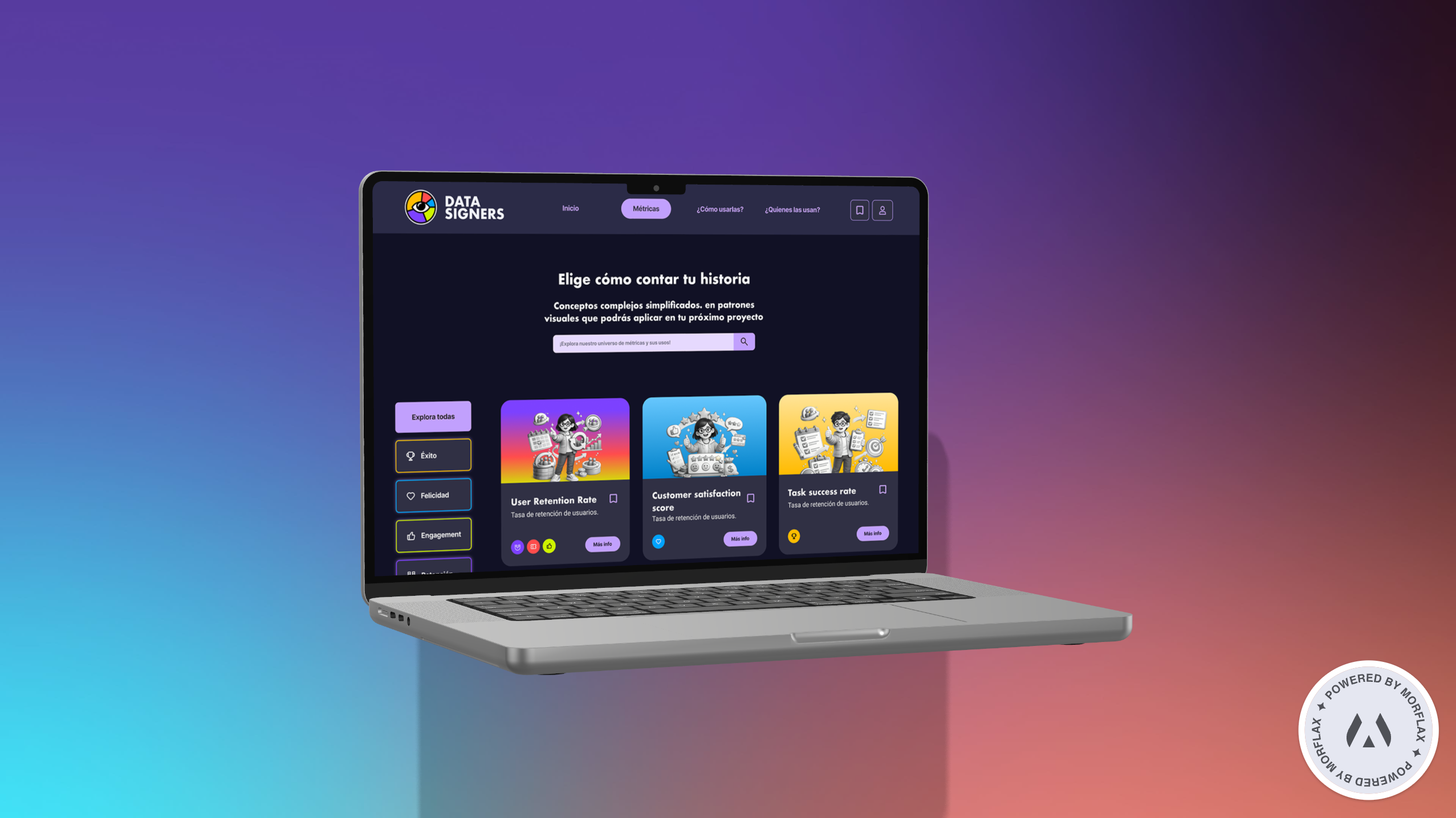
A educational platform that translates UX metrics into applicable visual patterns, designed to have LATAM's designers and students make informed decisions and defend them with data.
| ROLLead UX / IU Designer | DURATION12 weeks | CONTEXTAcademic project | _Web responsive · MVP |
| METHODDesign Thinking | FRAMEWORKHEART (Google) | HERRAMIENTASFigma | YEAR2024 |
EXECUTIVE SUMMARY
Datapiers is an educational web platform that cataloges UX metrics and organizes them under Google's HEART framework. It's designed for product designers and students who need to make data-supported design decisions, in a context where information about UX metrics are dispersed, in English and disconnected from real cases.
The problem
The designer at LATM learns UX metric from fragments: Twitter threads, academic papers, blogs translated without context. When the time comes to decide what to measure against a real DIREL, knowledge does not translate into criterion. The result is a presentation to the client where the design decisions are held in intuition, and not evidence.
The solution
A platform with three entrance doors - Métrics, Framework and Rils - that allows users to get to the concept from where it's most natural. Each metric has a consistent tab that always answers the same questions: why it matters, how it's computed, where to apply it, what companies use and what tip UX holds its use. The HEART taxonomy works as a leading thread that binds the five dimensions of user behavior - Happiness, Engagement, Adoption, Retention, Task Success - with every metric of the catalogue.
The expected impact
- Understanding: The user locates the metric they require in less than 60 seconds.
- Trust: He puts his decisions with a replicable technical argument, but his decisions are unimprovised.
- Community: consolidate a common vocabulary about Spanish-language metrics, anchored at HEART.
PROCESS - How I worked this project
I applied Design Thinking in five phases (empathize, Define, Ideate, Protoctipar, Test) and treated them as iterative cycles, not as linear steps. Each phase produced a dedicated concrete that fed the following, and the findings of the testing gave me back to empathy as what I learned required.
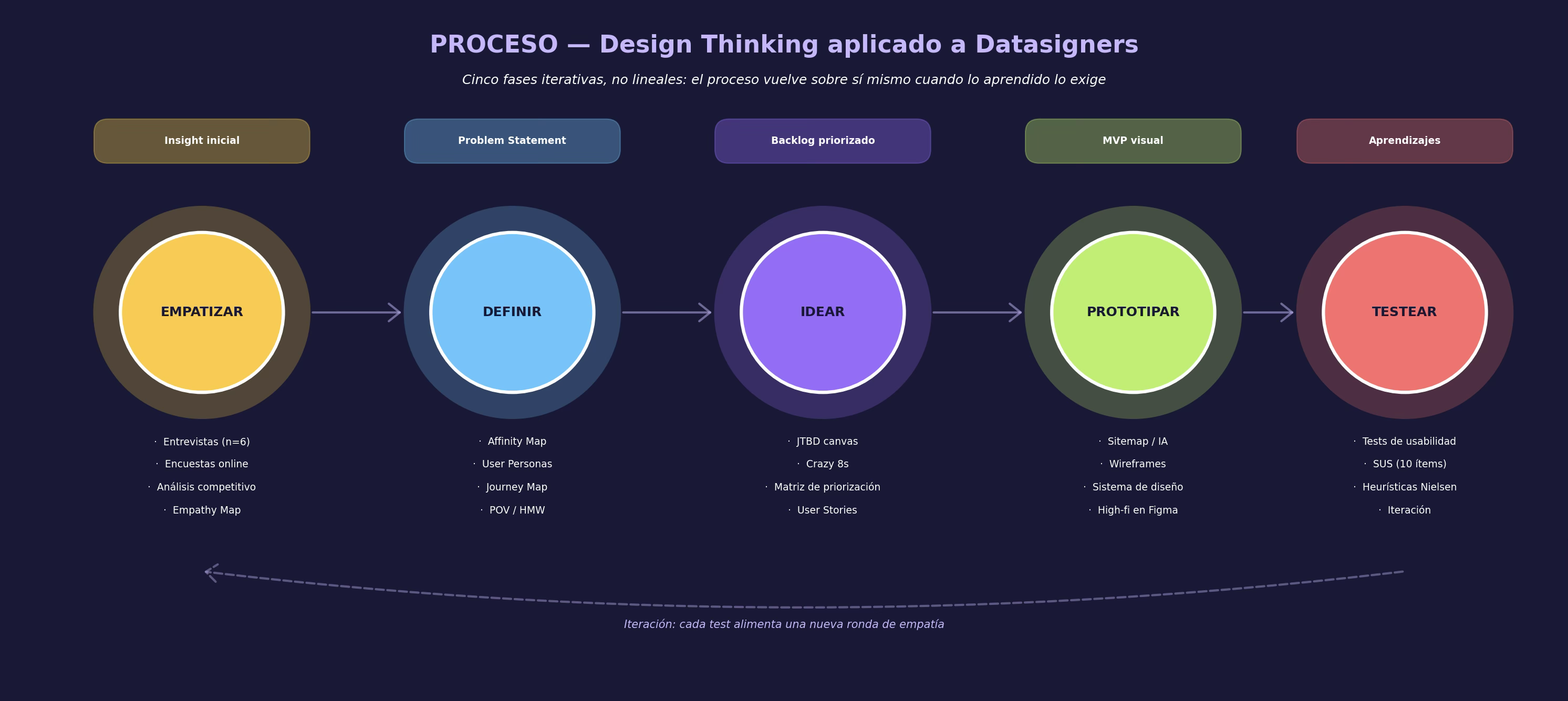
Figure 1. Overview of the Design Thinking process applied to datapipiers.
The criterion for returning to an earlier phase was always the same: if a design decision could not be supported by something that research had revealed, research was insufficient. That principle, which works as an operational guide to the project, became also the product's thesis: decisions are held in evidence, and not in preference.
_ Listen before designing
I started without assuming what a designer needs to make datat- information decisions. I wanted to understand the actual friction, not the one I thought. That's how I combined three methods: in-depth interviews, a quantitative survey and a competitive analysis of the sources that the target public already consumes.
Research methods
Semi-structured interviews (N = 6)
45 minutes with 3 midlevel designers at digital companies from Lima and Bogotá, two Juniors at agencies and a seventh cycle student at Graphic Design. The guide revolved around three questions: how do you decide what to measure when you get a briefing, how do you find information about a new metric and how do you propose your decisions to an PM or client?
Quantitative survey (N = 42)
Distributed in LinkedIn and Discord UX communities. I have been using hypotheses about frequency of using metrics, regular tools and level of safety while defending decisions. Three data confirmed the project direction:
- 78% recognised the HEART framework by name but only 23% applied it structured.
- 64% look for information about metrics at Google first, and not at formal courses.
- 81% considers their level of insecurity to be "moderate" or "high" by translating UX findings into business metrics.
Competition analysis
I studied 12 sources that target public already consumes: Nielsen Norman Group, Smashing Magazine, Mobbin, UX Collective, Coursera, Coderhouse, as well as four Twitter threads and two newsletters. Most have quality content but none offer a consistent taxonomy that allows to compare metric with each other. That was the crack that Datapiers decided to occupy.
Empathy Map
Synthetic interviews at an Empathy Map forced me to separate what the user says from what the user does and feels. The distance between these four dimensions is where the Insight lives: Carolina says she can measure but thinks she lacks criterion and does A / B tests but she's insecure about defending results.
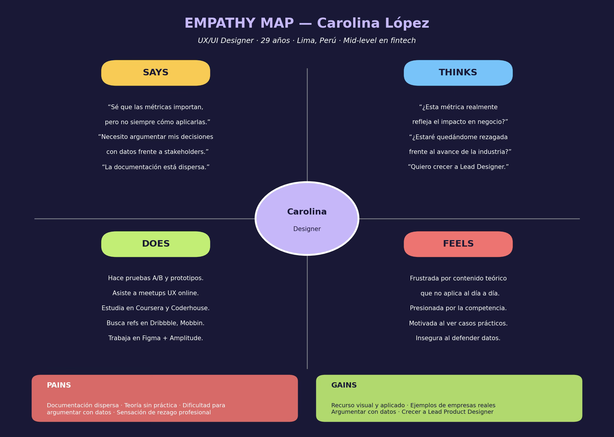
Figure 2. Empathy Map from Carolina, project's leading person.
FASE INSIGHT
The user's knowledge isn't the problem. That's confidence by translating that knowledge into defensible arguments about stakeholders.
Persons
Research became two archetypes. I did not build them as decorative fictions: every demographic attribute is supported by public data about the Peruvian and Latin American digital ecosystem (DataReportal 2024, Glassdoor, AméricaEconomics, Vertiv). I put them next to each other because they share a central friction, but they live them at different intensities.
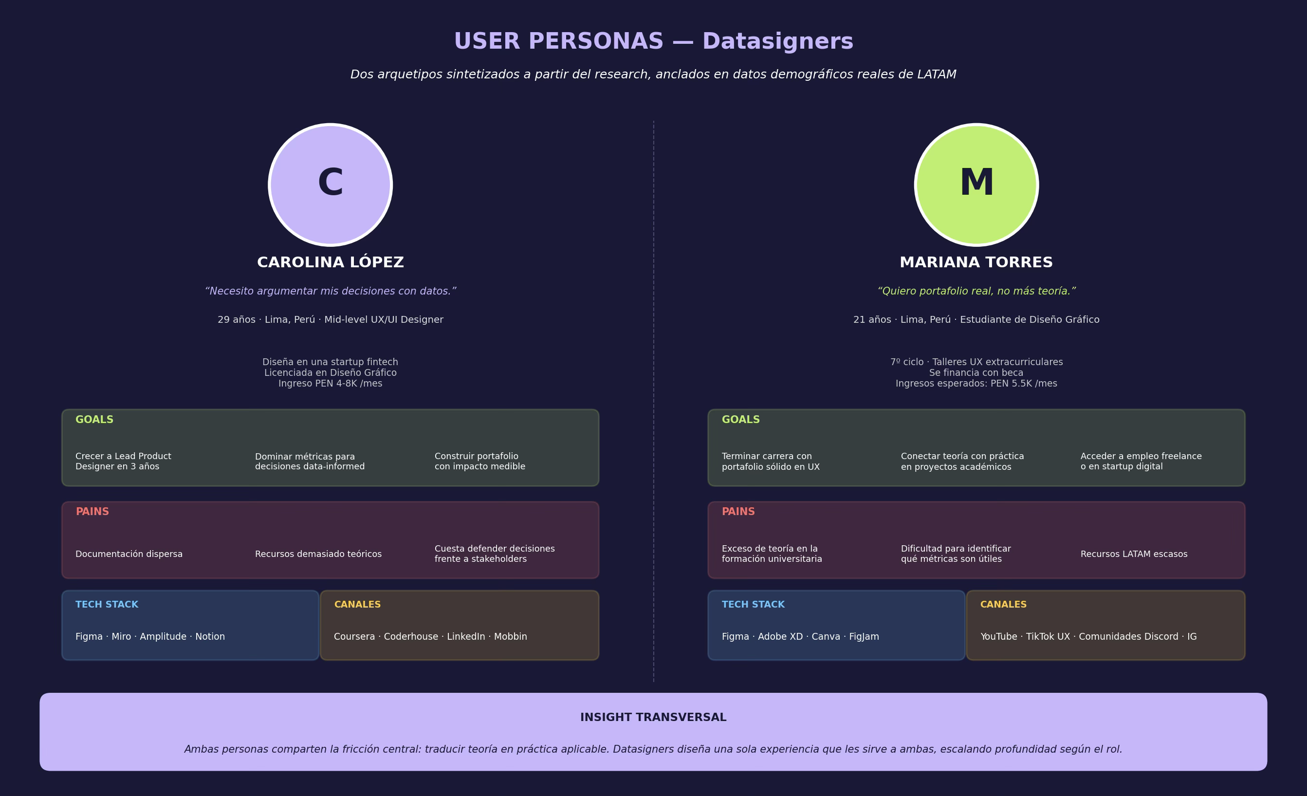
Figure 3. Comparative synthesis of both User Persons: Carolina (mid-level) and Mariana (student).
Carolina López - The designer who needs to defend what she already knows
29 years old, mid- level at a startup fintech light. He knows his tools, has been training at Coursera and Coderhouse and works with his first and first mobile flows with Figma and Amptitude. The friction for Carolina isn't to learn - it's to synthesize and argue. When an PM asks for "theoretical fundamentals" after his decision to move a button, the conversation becomes a re-translation effort that was not his initial brief.
Mariana Torres - The student who wants to apply what she's learning
21 years old, seventh cycle of graphic design. He attends UX / UI extracurricular workshops and hears about the state of art by TikTok and YouTube rather than by the curricular mesh. Her friction is opposite to that of Carolina: she has time and motivation to learn but lacks real projects where to apply Learning. He needs a resource that puts his place between academic theory and industry cases.
DIRECTORATE DECISION
A single platform for both profiles. The depth is chosen by the user while browsing: Mariana enters through the framework door to learn the theory and Carolina enters through the Métricas door to solve an individual case.
Customer Journey Map
I mapped the Carolina Journey at the most representative stage: a redesign brief where you have to defend a metric against your PM. I worked five phases - Discover, Investigate, Filter, Apply, Defend - and for each I documented actions, thoughts, emotions, pain points and opportunities. The emotional curve was the most revealing fact: frustration doesn't appear at first, it appears at the centre of the journey, just where the user has to filter information without a clear criterion.
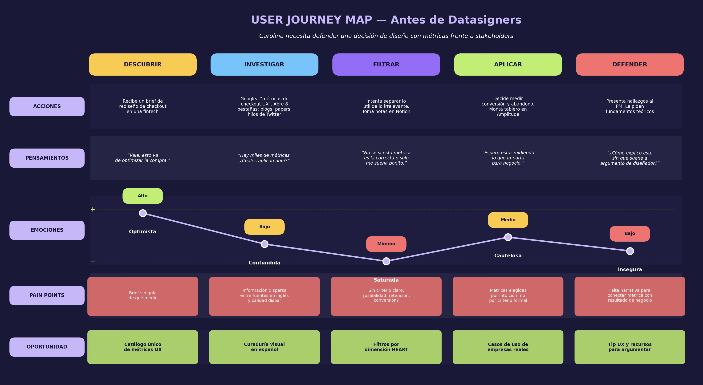
Figure 4. Journey Scenario Map "Before Datapipiers. "The emotional curve falls into the Filtering phase.
FASE 02 · DEFINIR - Synthetic to find the actual problem
Research generated nearly 200 notes: interviewing, survey observations and competitive findings. The phase of definition was to put that material together, to find the dominant issues and to translate them into an enforceable problem.
Affinity Diagram
I worked clustering at FigJam, moving notes till four issues emerged and they supported each other. They weren't labels I chose. They were groups that the material formed with little intervention from me. When the notes were naturally grouped about "fragmentation of knowledge," "theory without applying," "distance with business" and "need for reference," I knew research had reached saturation.
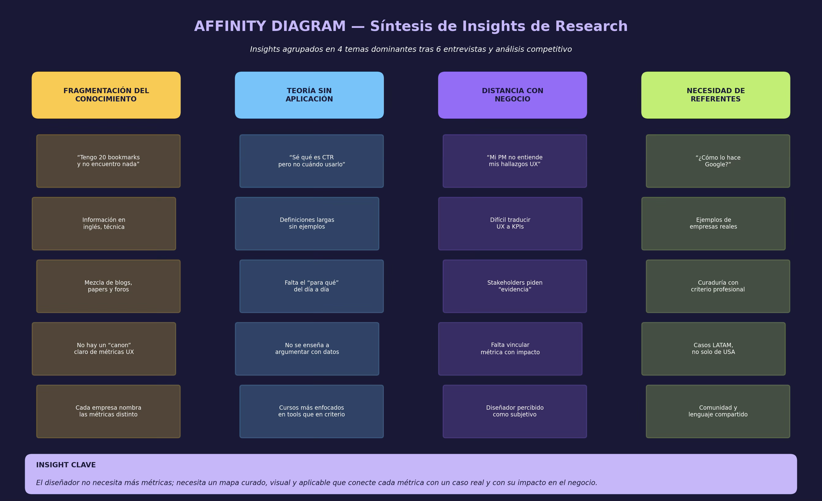
Figure 5. Affinity Diagram. The four clusters converge into a single key insight.
Of the four clusters I distilled three POV statements in "User + Need + Insight" format. They work as a compass: Any feature that you design should be able to fight back with one of them.
| POV | Statement |
| POV-1 | Carolina, a midlevel designer, needs a clear taxonomy of UX metrics because information scattering forces her to improvise criteria every time she gets a brief. |
| POV-2 | Mariana, a design student, needs applied examples of metrics in real companies because academic theory doesn't give her concrete evidence with which to build his portfolio. |
| POV3 | Both people need a bridge between metric and business argument because without them their design decisions are perceived as subjective by their stakeholders. |
I turned every POV into how Might We questions - the formulation that opens up the exploration space without tying up the solution. These are the ones that survived the filtering:
- HMW-1 offer a visual taxonomy that will allow recognition of a metric in less than 10 seconds.
- HMW-2 to connect each metric with actual company use cases, but with separate definitions.
- HMW-3 To allow users to filter metric by performance dimension (what they want to measure), but not by name.
- HMW-4 include an UX tip by metric that the designer can get to his next meeting.
The designers and students at LATM have no information about UX metrics and have a cured, visual and applicable map that will allow them to identify the right metric for a particular problem and to uphold their decision with evidence against stakeholders.
FASE 03 · IDEAR - From problem to backlog
With a firm problem statement, the idea stopped being an open brainstorming and became a succession of filters. Three tools guided the phase: Jobs To Be Do to ensure that every idea responded to a real job, User Stories to translate JTBD into implementation and a prioritization matrix to decide what entered the academic MVP.
Jobs To Be Do
The JTBD framework forced me to think about the product as a "metric web," but as a work that users hire. The most interesting thing came about by separating the three dimensions of the job: the functional one is just the tip of the iceberg and the actual weight is in the emotional and social dimension.
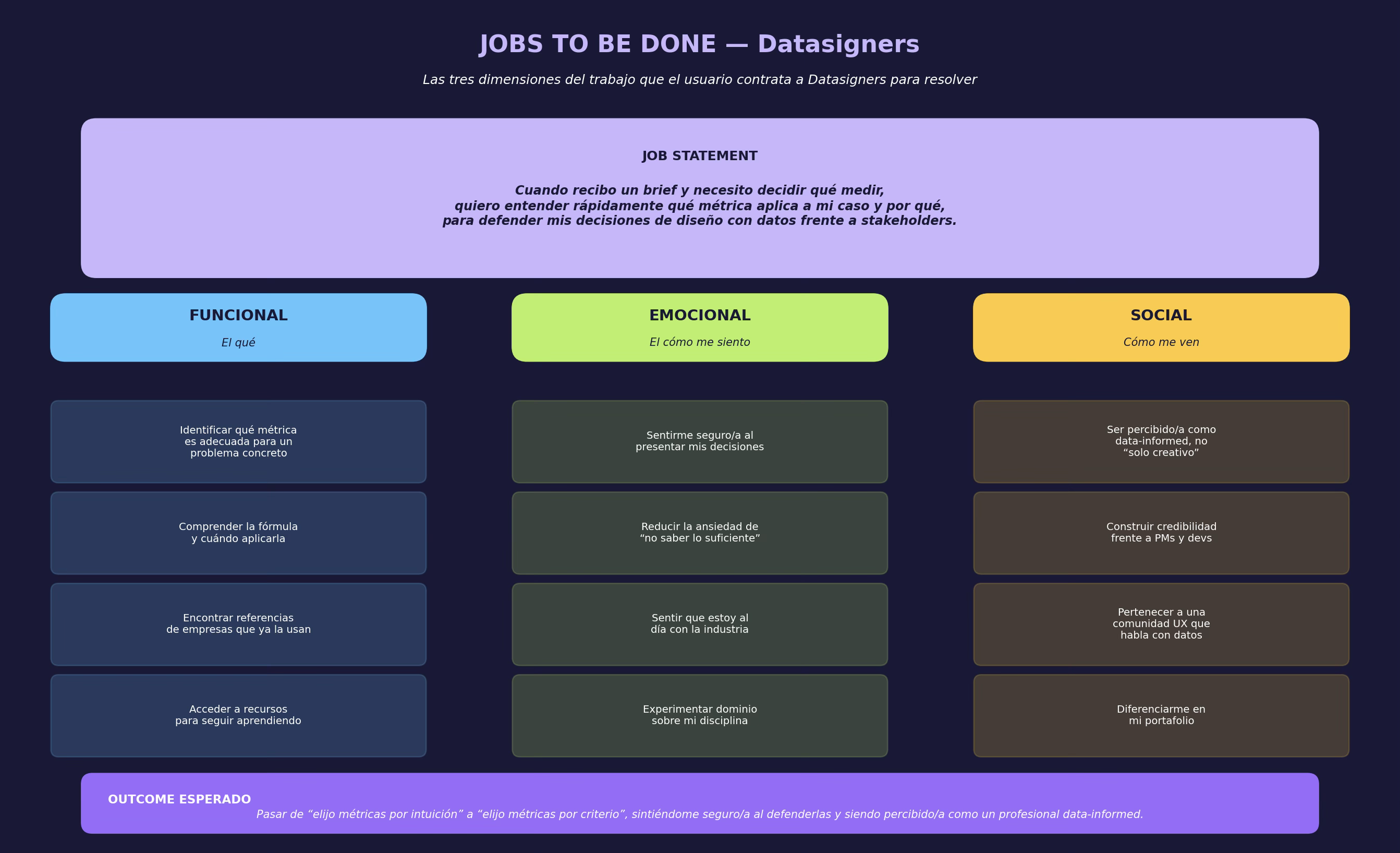
Figure 6. Canvas Jobs To Be Do with job statement and three dimensions of work.
PRODUCT REFIRE
Datapiers doesn't sell information about metrics. It sells professional confidence to the user who has to uphold a design decision with data. All information we offer is car, no end.
User Stories
I translated Jobs and HMW to User Stories in format "as [role], I want [action], for [benefit]." Each story includes measurable acceptance criteria, making them directly dependent on sprint.
| ID | User Story | Acceptance criteria |
| US-01 | As a designer with a brief in hand, I want to filter the metric by HEART dimension to quickly identify which ones apply to my case. | · The filters correspond to the 5 dimensions HEART · More than one filter can coexist (chip-style) · The list will be updated without page recharging · Visual card identifies the dimension by color |
| US-02 | As a student exploring, I want to see a page dedicated to the HEART framework to understand complete theory before applying individual metrics. | · independent page with 5 dimensions · Each dimension exposes what measures, where to find them and why it matters · Includes typical signs and examples by dimension |
| US-03 | As a designer with findings, I want to see cases of using real companies for every metric, to hold my argument with a reference. | · Minimum 3 cases per metric · Each case identifies the context, the company and the result · Accompanying illustrations consistent with the visual system |
| US-04 | As a new user, I want to understand what Datapipiers does in less than 10 seconds to decide if it's good for me. | · Hero with an explicit value proposal · Three cards showing entrance doors |
| US-05 | as a designer at a sprint, I want an UX tip by metric to get him to his next meeting without have to synthesize it myself. | · Tip with each metric sheet · Maximum 3 sentences, adjustable · Neutral, non-academic language |
| US-06 | As a user who found a useful metric, I want to save it to re-consult it without having to look for it again. | · Keep Button on Card and tab · Local persistence (Academic MVP, without account) · Listing accessible from the User Section |
| US-07 | As a designer deepening into a metric, I want to see related metrics to build a system, not to use it independently. | · Block "related technologies" at the end of each tab · Minimum 3 relative metric visible · Click-through to detail without losing the context |
| US-08 | As an underexperienced student, I want to have an outside remedy at the end of every metric to deepen after that. | · Section Resources on each tab · Minimum 2 links verified by metric · Visual indicator of the type (paper, video, blog) |
Priority matrix
With fourteen feature candidates on the table, I needed a criterion to decide which ones entered the academic MVP. I used an Impact vs. Effort matrix, where Impact was weighted according to POVs coverage (how many POVs solve each feature) and Effort according to estimated hours at Figma + editing time.
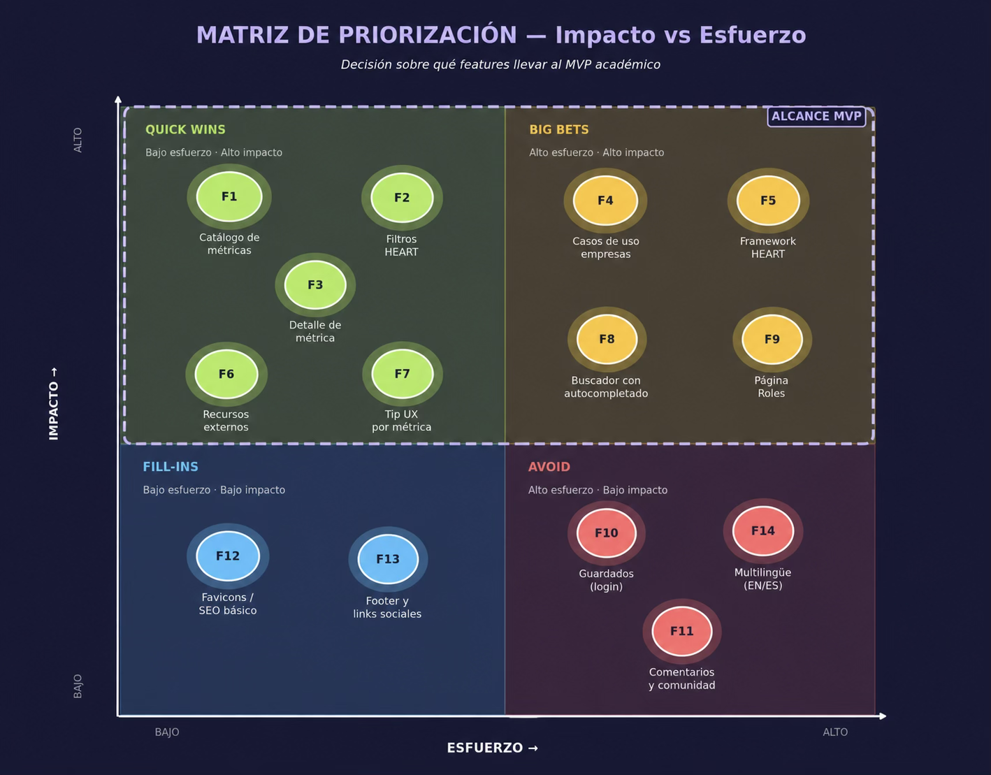
Figure 7. Matrix Impact vs. Efforts. The MVP range includes complete QuickWins and the most strategic Big Bets.
What entered MVP
The final range concentrates seven pieces: catalogue of metric with HEART filters (F1, F2), details sheet with rich template (F3), page dedicated to the HEART Framework (F5), cases of metric use (F4), tip UX (F7) and external resources (F6). It's the minimum combination that cover the three POVs and allows to test the central hypothesis of the product.
What's been put out (and why)
- Page of Roles (F9): remains as a navigable skeleton with an "In Development" mark to validate with users an interest without building the logic of recommendation yet.
- Stretch and account system (F10): The local storage cover the user's promise at 80% of the cost.
- Community and comments (F11): high care and restraint are required and cannot be tested with an academic MVP.
- Multilingual EN / EN (F14): The proposal differs by talking to LATM in Spanish and the English dilute the bet.
FASE 04 · PROTOTIpAR
Building the experience
The prototipate took three weeks and was resolved on four parallel fronts: information architecture, design system, editorial content and high-fidelity screen composition. Each front fed the next with pieces that were already tested.
Information architecture
The first deliverable was a sitemap that responded to a simple question: what are the user's mental routes? Research had revealed three forms of entry: the one that looks for a concrete metric (Carolina with his brief), the one that wants to learn complete theory (Mariana in exploration) and the one that comes from a specific role (a curious Product Manager). The IA reflects these three forms as first level branches: Metrics, Framework and Rils.
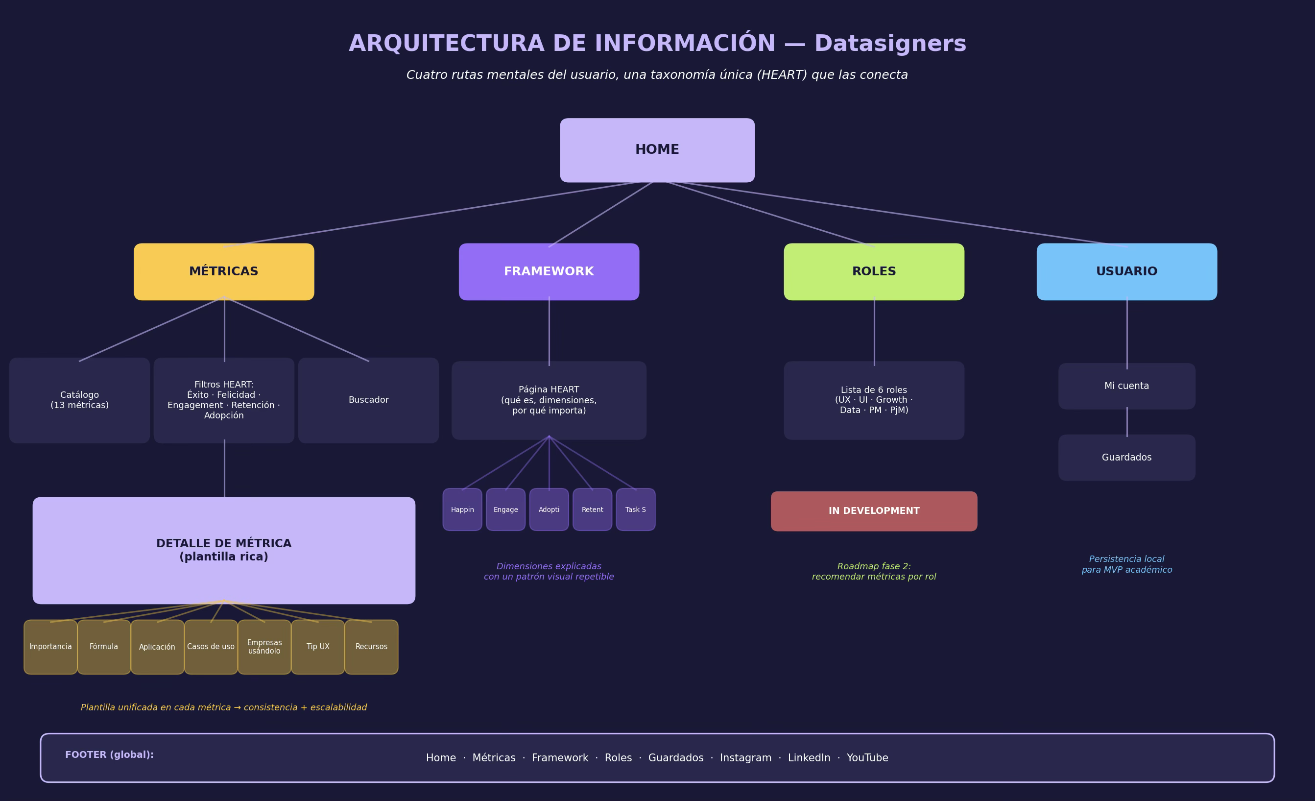
Figure 8. Information architecture. A single taxonomy (HEART) crosses all four branches.
ARQUITECANIC DECISION
A single taxonomy - HEART - crosses all three branches. Taxonomic consistency is what allows the user to leap between Framework and Metrics without reconfiguring his mental model.
Service Bluefrint
The blueprint extends the journey to the invisible processes that sustain the experience. I built it because, while Datapiors isn't a service in the classical sense, it does depend on a constant editorial work that the user doesn't see: caseshow, resource update, visual system maintenance. Documentalizing this makes clear what remains within the Academic MVP and what the Roadmap of the next phase requires.
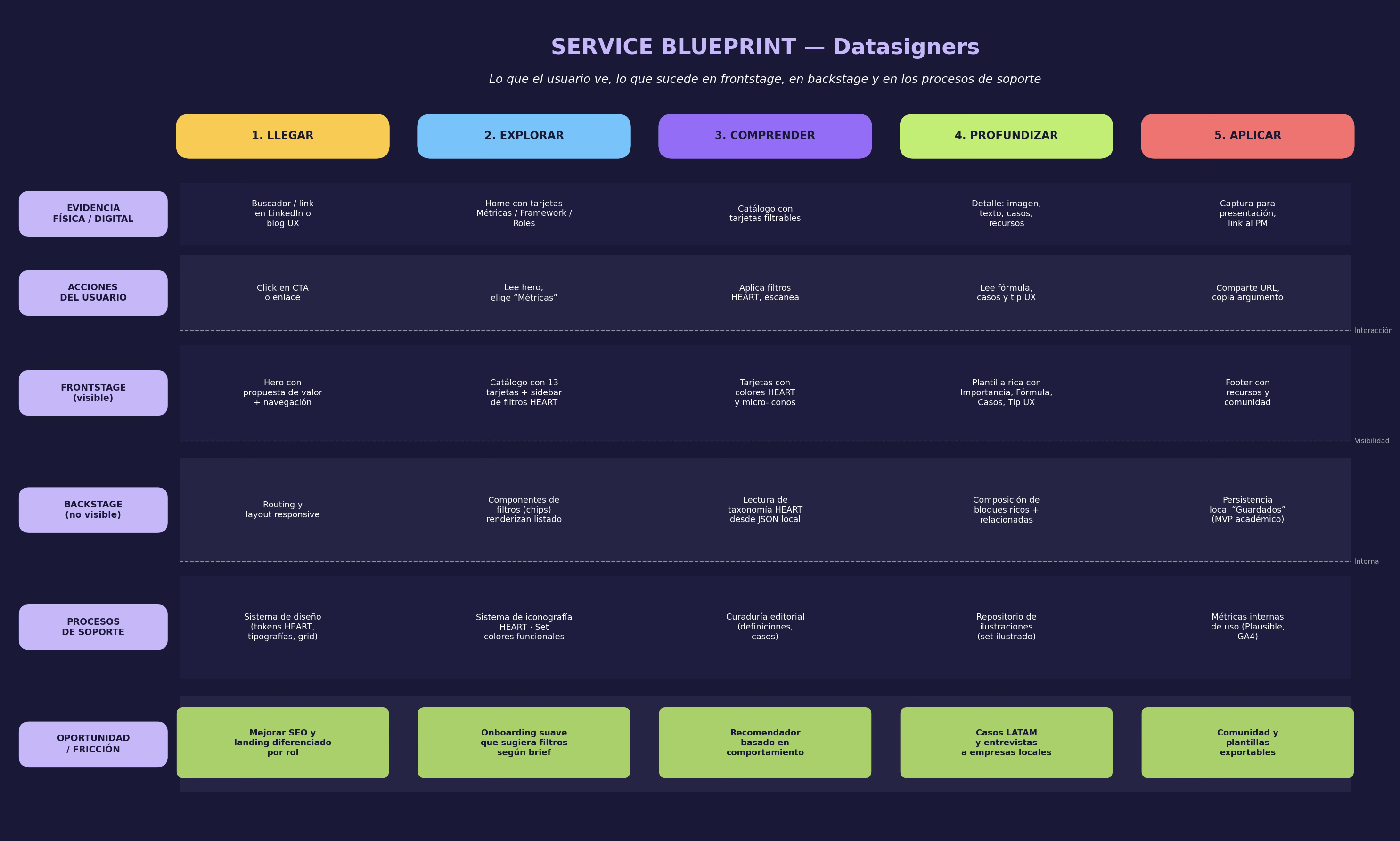
Figure 9. Service Blueprint with the five moments of use and the support processes that enable them.
Design system
The visual system came from a restriction that became virtue: HEART has five dimensions, so the system needs five functional colors before anything else. Each dimension has a color and an icon that are consistently repeated in cards, filters, illustrations and detailed blocks. When the user sees a yellow circle with a trophy, he knows that he's looking at some Task Success - before reading his label.
| HEART dimension | Color | Meaning in system |
| Happiness | Blue | Satisfaction and affective perception of users. |
| Engagement | Green lime | Depth and intensity of interplay. |
| Adoption | Red coral | Speed and volume with which new users incorporates the product. |
| Retention | Purple | Product capacity to retain the user in time. |
| Task Success | Yellow | Effectiveness and efficiency with that user complete critical tasks. |
On this five-color basis, the system adds typography (Arial for long text, a hypographic display for hero and sections), a 12-column grid, isometric black and white illustrations with color hales that strengthen the dimension and a synthetic iconography that identifies each metric.
Fingerboards
Five screens complete MVP. I show them in the order that users conduct them.
Home - The 3 entrance gates
The hero opens with an explicit promise: "Visializes the data after your decisions." Below, three big cards run as entrance gates: Métrics, Framework and Roles. The fourth card, deliberately placed as a lateral feature, invites the user who still doesn't know how to start exploring the Roles Section, marked "In Development." That brand serves a dual purpose: it communicates honesty about the status of the product and at the same time valid interest without requiring that logic be complete.
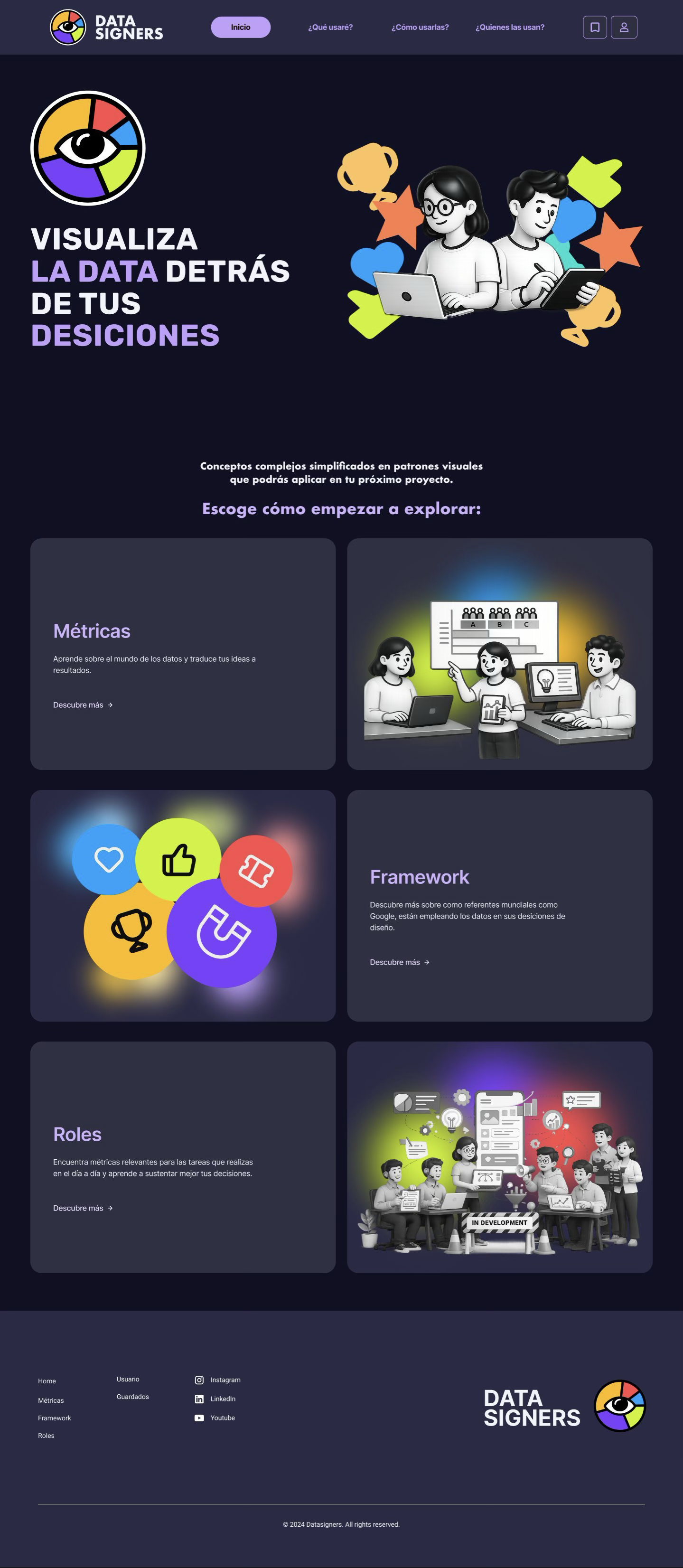
Figure 10. Home. The three entrance gates to the system.
Meter catalogue - The exploration layer
The catalogue presents the thirteen MVP metrics in a grid with the common visual pattern: isometric illustration, HEART dimension by color and name + short description. The left side bar contains HEART filters as chips: Success, Happiness, Engagement, Retention and Adoption. The user can combine them without recharging the page, and a superior search engine allows shortcuts as soon as you know what you are looking for. The micro- interactions of filters and storage icons were specified in Figma with lover and activated states.
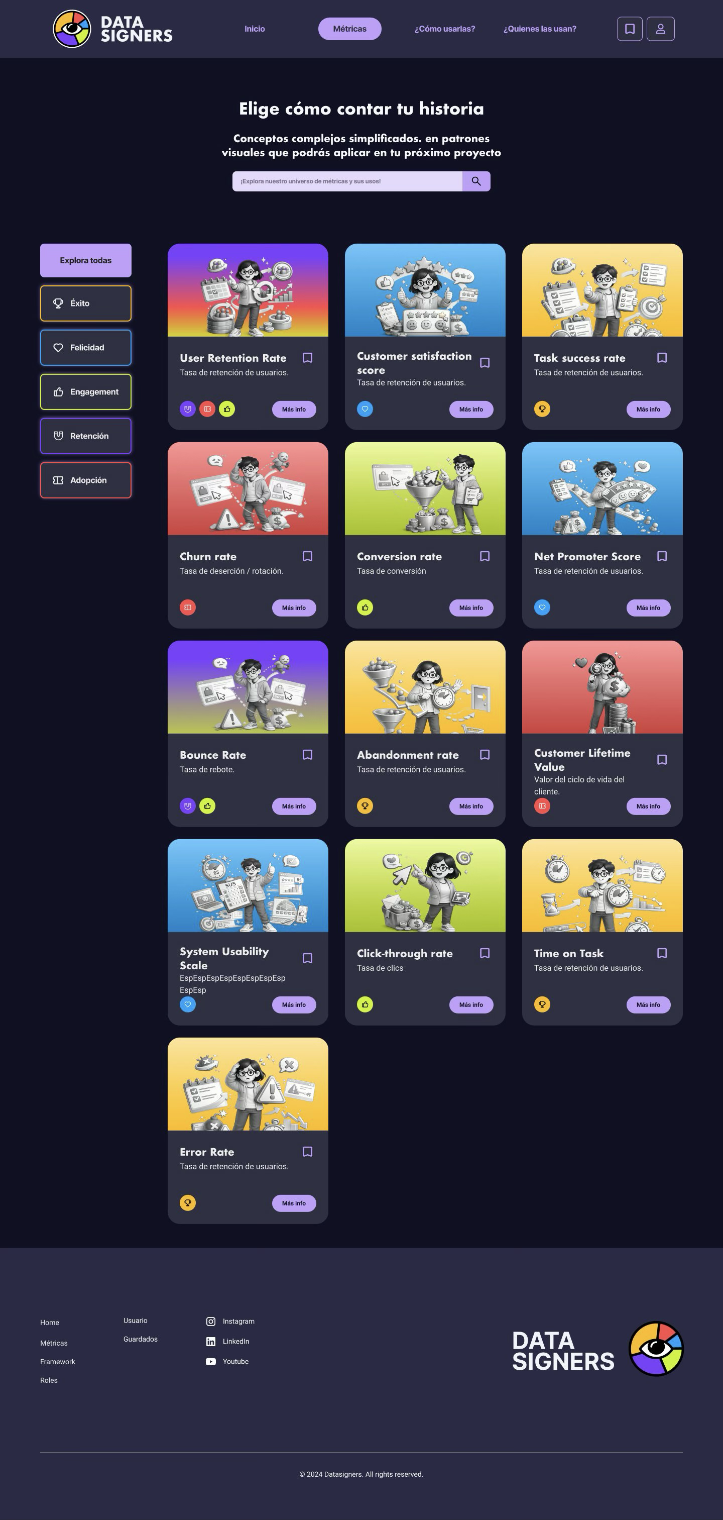
Figure 11. Catalogue of Métricas. HEART filters such as chips, search and cards with color-coded dimension.
HEART framework - The pedagogical phase
That's the theoretical anchor. The structure responds to a decision: each dimension is explained with the same template - what are you measuring, where to find it, why it matters, typical signs. The consistency of the template is what allows users to learn quickly: when they have already read the first dimension, they know what to expect from the remaining four. The Leader presents an illustration of the complete framework and an explanation that links HEART to the promise of the product: turn intuitions into evidence.
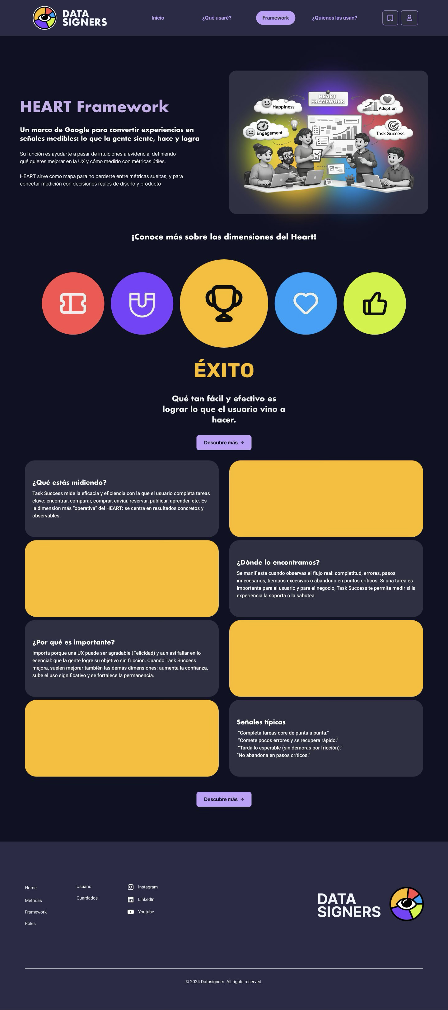
Figure 12. HEART framework. Reducible structure by dimension - Success, expanded at capture.
Roes - The implementation layer (currently under development)
The Roles Section is the visible Roadmap. Six cards have product cycle profiles - UX Designer, UI Designer, Growth Market, Data Analyst, Product Manager and Project Manager - each with a short description of what they do and what they measure. The detailed interplay (recommend metrics by role) remains as phase 2 of the product, but the page exists at MVP to validate interest and give rise to a second visit.
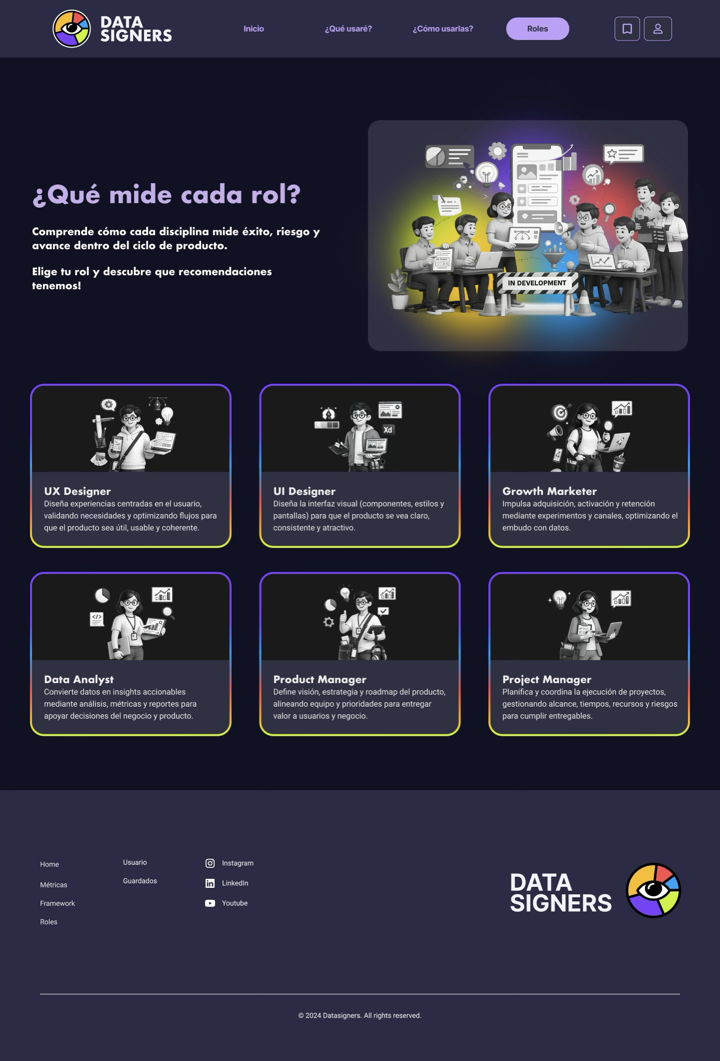
Figure 13. Roes. 6 profiles with navigable skeleton and recommendation logic remains Roadmap.
Meter Detail - The Depth Layer
The tab of each metric is the densiest piece of the product and the most time it took to design. The template always answers the same questions in the same order: Importance, Formula, Application, Cases of Use, Companies using them, Tip UX and Resources. That editorial consistency is strategic: the user learns his or her template once and then only has to learn his or her contents, and not his or her structure.
The left side bar works as a table of navigable contents, reducing scroll for users who come with a specific question. The "Cases of Use" Section occupies most of the page's vertically: it's the central Insight - see how Spotify, Google or Free Market apply the metric - that converts information into argument. At the end, a block of "related Métrics" invites users to continue to explore laterally, and not only in depth.
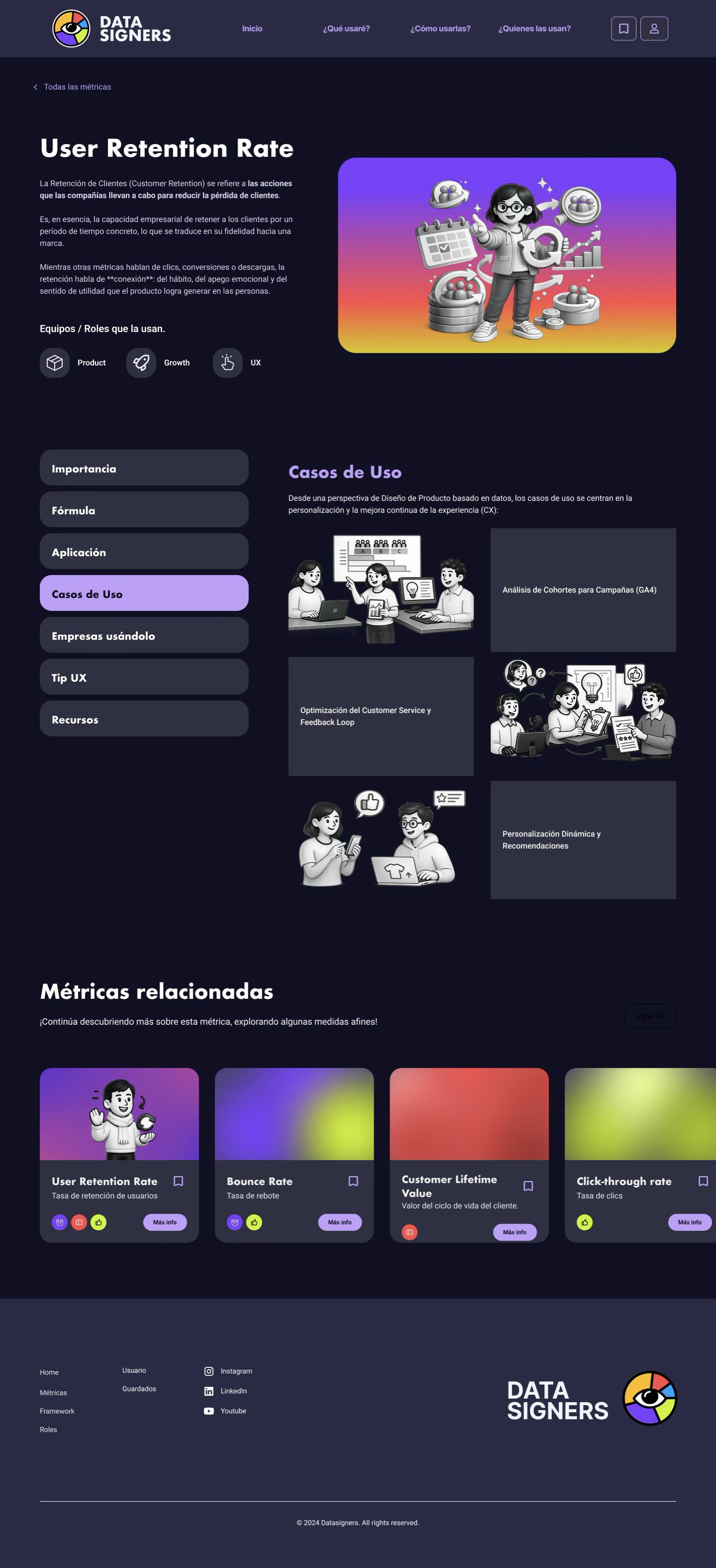
Figure 14. Ficha de detención de la metrics User Retention Rate. Diebar navigation + relative high and metric template.
FASE 05 · TESTEAR - Validate with real users
The MVP's testing combined three methods: moderate usability tasks with five participants, a heuristic assessment using Nielsen's principles and the SUS (System Usability Scale) scale administered at the end of each session.
Test design
Five participants - three from the Carolina and two from the Mariana profiles - received three tasks in randomized order:
- Task 1. Imagine you're working on redesigning an onboard and you need to measure if new users complete the first flow. Find the right metric and explain why you chose it.
- Task 2. Your PM's asking you exactly what the HEART framework is. Find the information you need to answer them in less than two minutes.
- Task 3. Your team's debating if User Retention Rate's the right metric. Find at least two cases of using companies using them to support your argument.
Quantitative results
| Metrica | Strategy 1 | Task 2 | Strategy 3 |
| Success rate | 100% | 100% | 80% |
| Average time (s) | 47s | 38th | 92s |
| Average errors | 0.4 | 0.2 | 1.6 |
| Satisfaction (1-5) | 4.6 | 4.8 | 4.0 |
The Usability Scale system at the end of the session had an average score of
82.5 about 100 - above the 68 mark marking "good" and very close to the "excellent" threshold (≥ 85). It's a promising result for an academic MVP, though the sample (N = 5) limits its inferential capacity.
Qualitative findings
What worked
- The repeatable template of the details sheet was mentioned by 4 out of 5 participants as "easy to read once you understand the pattern."
- HEART filters as chips reduced metric location time versus free search, especially for midlevel participants.
- The association color- dimension It was learned intuitively: after the second metric, the participants advanced the dimension by the color of the card.
What Failed
- Strategy 3 - Cases of use. Two participants tried to search "cases" or "companies" at the main search engine before entering the details of the metric. Section's up, but it's undetectable from outside.
- Sidebar from the tab. Three participants did not notice the internal navigation sisebar at the first visit. They did linear scroll instead of jumping between sections.
- Section Roles. The brand "In Development" was interpreted by two participants as "this Section's broken." The intention (Validation of interest) was not transmitted.
Iterations applied
The testing returned the process to a prototipate mini-iteration. Three adjustments responded directly to findings:
| Finding | Retirement |
| Undisclosed cases of use | The "Business Cases" chip will be added to the catalogue's side filter. The global search now indicates names of companies mentioned in each tab. |
| Unseen Sidebar | The sidebar goes from a neutral to a lavender background with an outstanding active item. In mobile, it becomes a straight head with horizontal scroll. |
| "In Development" misinterpreted | Reformulated as "Coming up: recommendations by role" and an opt-in to get notice when available. It turns friction into a sign of interest. |
RESULTS AND challenges
What the project taught
Datapiers close the academic cycle with a functional MVP, validated with actual users and tipped above the good usability threshold. More important than the metric, however, were the learnings that the process left about how to work research and translation to product.
Project technologies (Datapipiers applied to itself)
To design a product about metrics requires them to take their own metrics seriously. These are what MVP propose for phase 2:
| HEART dimension | Metrica | How to apply it to datapipiers |
| Happiness | Customer Satisfaction (CSAT) | A brief survey at the close of each session: did this fact sheet prove useful? |
| Engagement | Time on Task | Average time in a detail sheet. Less than 30 seconds suggests that the tab isn't reading and more than 4 minutes suggests that the contents have been attached. |
| Adoption | Conversion Rate | % of visitors get to home and cross at least one of three gates. |
| Retention | User Retention Rate | % of users back within 30 days. The hypothesis: A second visit means that the user treats them as a tool, but not as an article. |
| Task Success | Task Success Rate | Efficacy to find a dedicated metric from the catalogue at less than 60s (replicable as a usability task). |
Decisions I made and I'll make again
- A single taxonomy. To cross the whole product with HEART eliminated conflicts of mental model. Each time I was tempted to add another classification (by industry, by product type), the simplicity of a single lens earned.
- Reportable plate. The consistency of the detail sheet is what the testing best valued. What at first felt as editorial rigidity became the main driver of usability.
- To say no to the multilingual. The product's competitive differentiation is about talking to LTAM in Spanish. Add english would have diluted the bet and doubled the editorial cost.
- Show the "In Development. " Although the testing revealed that the brand confusing, showing the visible Roadmap was a right decision - just needs better copy.
Decisions to be re-evaluated
- Local persistence rather than accounts. He covered MVP but the testing revealed a desire for synchronization between devices. The future product will likely require a minimum account system.
- 13 metric in the catalogue. Sufficient to prove the hypothesis but some participants were expecting a more comprehensive catalogue. The balance between editorial depth and scope of the catalogue deserves more research.
Next steps
Proposed Roadmap for phase 2 of the product:
| Phase | Hito | Detail |
| Q1 | Iteration after testing | Apply 3 iteration of IU (company chip, outstanding sideebar, copy of the In Development). |
| Q2 | Recommendations by role | To activate the Roles Section with basic logic: each role suggests the most important 5 metric. |
| Q3 | System of accounts | Simple login (SSO with Google) to sync saved and unlock customization. |
| Q4 | LATAM cases cured | To progressively replace cases of U.S. companies with interviews with LATM teams. That's the competitive differentiation that research validated. |
PERSONAL REFLEXION
What I get
To design a product that teaches how to make decisions with data forced me to make my own decision with data. That symmetry between topic and method was, without me looking for it, the greatest lesson of the project.
Three considerations close the case:
Research
The initial six interviews have put me back at the first week. He had come to his project thinking that the user needed more information about metrics and research revealed that he needed less information, better cured. The difference between these two scenarios is the difference between a saturated and a useful product.
Priority
Deciding what remained outside of MVP was more difficult than deciding what was going on. The Impact vs. Efforts matrix did not give me answers and gave me a language to uphold my decisions with the team and especially with myself. Each dejected feature has a tractable justification.
About the design system
I learned that visual consistency isn't an aesthetic detail: it's the main vehicle for users to learn quickly. The repeatable template of the detail sheet, the five HEART colors and synthetic iconography did more for product usability than any feature that could have been added instead.
"The product isn't the sum of its features. It's the coherence of the mental model that invites the user to build."
- Project Learning
_