Call
Product Design & CRO Case Study · Structured under Design Thinking
From a generic agency page to a high conversion pas network.
Section 3
| Designer | Christian Valle · Chrisva Design Lab |
| Customer | LlamaLeads - Growth Marketing Agency |
| Industry | B2B Service · LATOM (Peru / Colombia) |
| Disciplines | UX Strategy · CRO · Visual Design · Research |
| Delivery | Full web playback (single-page, scroll-based) |
| Timeline | 6 weeks end-to-end |
| Tools | Figma · Hotjar · Google Analytics · Maze |
| My role | Lead Product Designer (Strategy, Research, Design and CRO Audit) |
Projected impact (industry's benchmarking)
| + 22% | − 30% | + 38% | + 45% |
| Leads conversion rate | Rebound rate | Scroll depth | Retirement of brand |
The metrics are evidence-based projections derived from published benchmarks for each implementation design intervention. Post-launch monitoring under way.
▪ Why Design Thinking + CRO
Most web redesigns fail because they treat the problem as esthetic When it's structural. Apply Design Thinking to a CRO project requires you to ask the right questions in the right order: first understand the user and his actual pain, then define the problem with precision and only then design - with every visual decision anchored to a measurable conversion hypothesis.
That case studied followed the five canonical phases - To empathize, Define, Ideate, Protoctipar and Test - and close with a reflection phase that document the apprenticeships for future projects.
FASE 1 - AMPATIZAR
To understand the business and the team and final client before questioning anything.
1.1 The starting point
LlamaLeads is a growing marketing agency that already had a business functioning. They generated interbound traffic through paid campaigns and organic search and a four-person team with proven track record delivering results to SMB customers in Peru and Colombia. The problem was not service - it was window.
His web was seen as any other agency: blue gradients, isometric stock illustrations, a grid of 6 services, and a form buried at the end of a long scroll. Visitors came curious and went unconverted, not because LlamaLeads was the right choice but because The place never gave them a reason to believe it was..
The initial briefing was direct: Redesign the web to turn traffic into trained leads. But the underlying challenge was strategic - LlamaLeads needed to stop communicating What do they do? and start communicating Why does it matter?.
1.2 Research methods applied
| Method | Objective | Key findings |
| Heuristic Evaluation | To evaluate 10 Nielsen Principles about today's web | The place rape "Match between system and the real world" - I was talking about an agency, but I was talking about a client. |
| Analytics Audit (G4) | To identify escape points from the project | Bounce rate 68% at desktop and at an average time at 38s and only 11% reached the form |
| Hotjar Heatmaps & Session Reforms | Observe true conduct | 73% of users leave before they get to the "Services" Section and nobody clicked second CSA |
| Stakeholder Interviews (foot + salts) | Mapping ipC, actual objections and frictions of sale | The repeated objections in sales calls were responded to on the web |
| Competitor Analysis (5 global LATOM + 3 agencies) | Identifying differentiation patterns and windows | The whole market used the same generic language - there was an enormous opportunity for opposition positioning |
| 5-Second Test (post-prototype, Test phase) | Validate first print of new hero | 10 of 12 participants identified the main CMA without prompt |
1.3) User Person
The most valuable section of the empathy phase. Each subsequent design decision was leaked by this profile.
Andrés Morales - "The Director of Rethetic Marketing"
| Age | 38 years |
| Rol | Director of Marketing and co-founder of SMEs |
| Location | Lima, Peru (also common archetype in Bogotá, Medellín, Santiago) |
| Industry | B2B services / E-commerce / Professional services |
| Company size | 8 to 25 employees, billing between USD 500K and 2M a year |
| Education | University (administration, marketing or commercial engineering) |
| Digital level | Mid-high. Drive Google Ads, meet CRMs, have contracted agencies earlier |
) its objectives
- Get challenges and challengesNo more leading.
- Scaling Business Without Scaling Sales Team proportionally.
- To reduce the cost of client procurement and to increase LTV.
- Internal justification of every weight invested in marketing with clear metrics.
- Find a strategic partnerNo more supplier.
) His frustrations
- He's hired 2 or 3 agencies earlier and was disappointed: "great promises, small results."
- He gets leads but Do not close - suspects that the problem is the quality of lead or monitoring.
- It feels lost at a sea of agencies that That's exactly what they say..
- It overwhelms you to decide between so many channels (SEO, Ads, email, content). He needs criterion, no more options.
- The agencies usually get lost after sale or get an account to a junior.
) His motivations
- Measurable growth: wants to show results to your partner, board or team.
- Operating quiet: does not care about managing the supplier and wants the supplier to deliver results.
- Professional re-employment: if you choose well, it remains as a leader. If his bad choice, he and his team pay.
- Time: every hour dedicated to evaluating agencies is an hour less selling.
How to decide
- Mode of decision: high consideration. Read the complete web before contacting.
- Trust drivers: actual faces of equipment · transparent process · results of comparable cases · clear response to objections.
- Trust Killers: generic language, stock photos, lack of process, absence of equipment, long forms.
- Reparations: Google Search ("digital marketing agency + town"), LinkedIn, recommendations, competition Facebook Ads that reorient to compare.
Reg.
"I have leading. What I need is a system that will turn them. And I need to know that you know what you're doing before you pay them a weight."
Reg.
| Person's tribute | Design decision that fired |
| One's own language: "I don't turn the leads I have." | The hero problem statement uses this exact frustration: "The problem isn't to generate more leads. It's not to have a system that will turn them." |
| He needs to watch his team before his confidence. | Equipment Section before from the final FTA, not at the Foter |
| Compare before deciding | Comparative table "Why Do I Call Leads?" vs. traditional agency |
| Read the whole page before contact | Filling architecture with no shortcuts and the main CSA appears several times at strategic depths |
| It overwhelms you with excessive choices | Services reduced to 3 premium cards, no grid of 6 |
| He lacks big promise | Process Section (phase 1 / phase 2) makes delivery tangible |
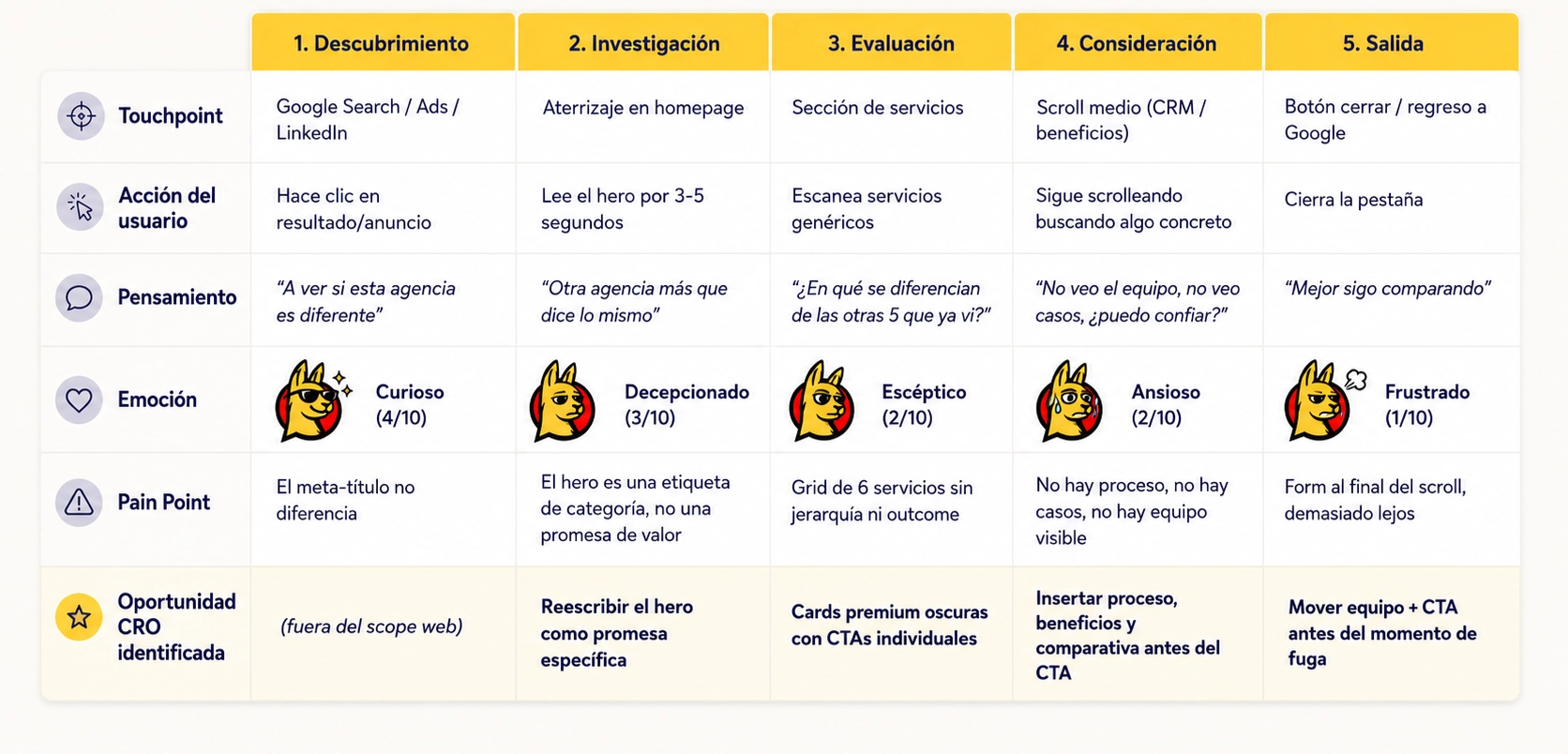
1.4) Customer Journey Map - ACTUAL STATE (Before Redesign)
Mapping of Andres's journey while interacting with his original web. Each fall in the emotional curve was a design hypothesis in redesign.
Stages of the journey
DESCUBRIMIENTO → INVESTIGACIÓN → EVALUACIÓN → CONSIDERACIÓN → [SALIDA]Detailed map
Retirement - Current status
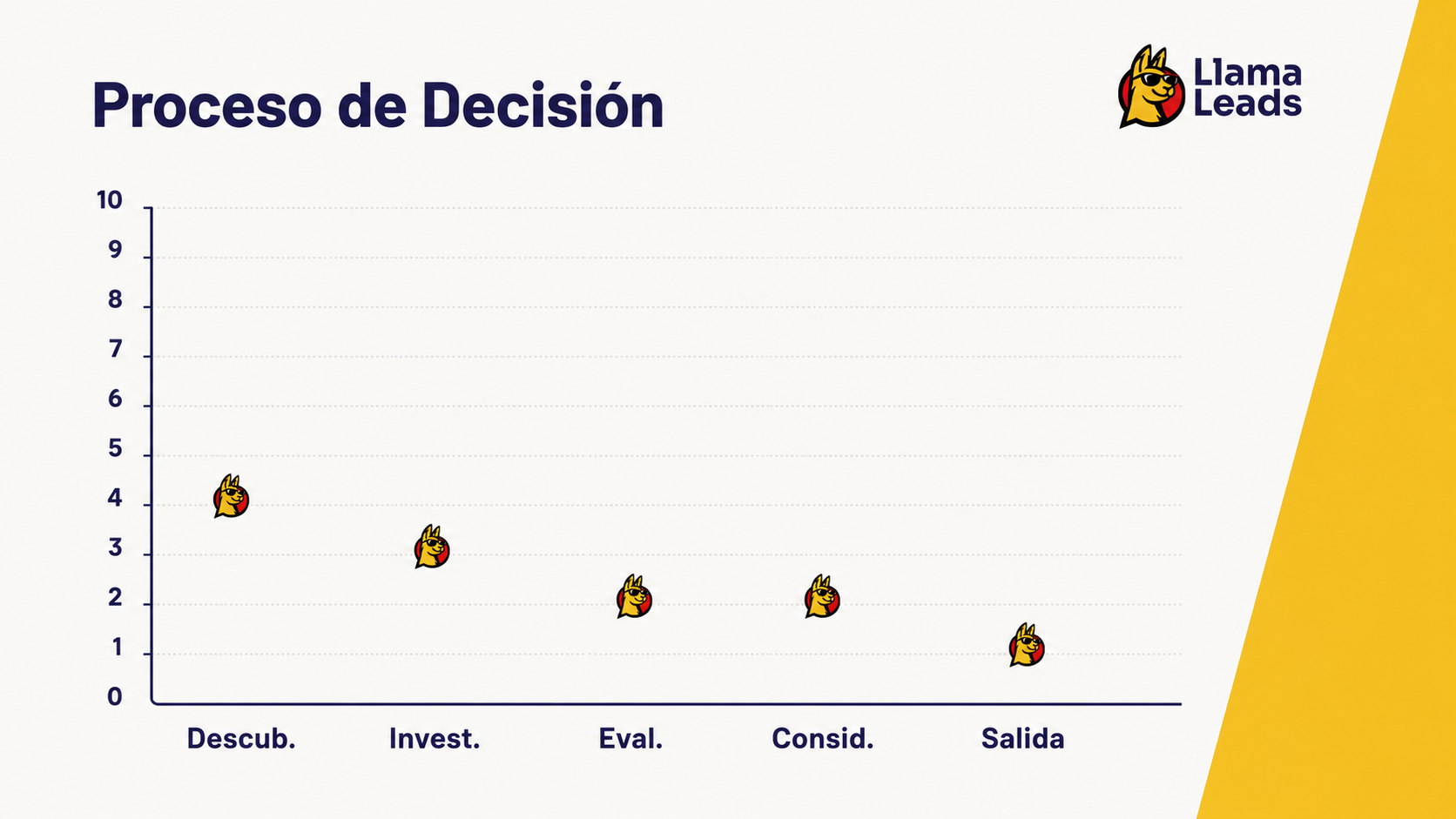
Key Insight: The most pronounced fall occurs between Discovery (4) and Evaluation (2). That's the segment where the site loses most leading - and that's exactly where redesign concentrates its best interventions.
FASE 2 - DEFINITION
To put research into a precise and enforceable problem.
2.1 Status of the problem
The LlamaLeads site indicates what the agency does but doesn't matter why. The visitor arrives with a specific business pain and finds a catalogue of services - generating a mismatch between the buyer's intention and the contents of the page that systematically kills conversion.
That's no aesthetic problem. It's a problem of sequencing: The site starts talking about LlamaLeads - who they are, what they offer, how they work - before they have given a single reason to care about them. To sell high-thought B2B services, that order's exactly the opposite.
2.2 The 7 UX / CRO malfunctions diagnosed
| ♪ | Problem area | UX / CRO impact |
| 1 | Generic Hero - category label ("Digital Marketing Agency"), without differentiation | Failed the 5 second test · high bounce rate |
| 2 | Absence of problem statement - leapt directly to sell services | Break the buyer's psychology · leapt pain activation |
| 3 | Soft visual palette - blue gradients, stock illustrations | Communica "secure and generic agency" - exactly the opposite of the promise of growth |
| 4 | Services such as 6 icon flat grid - without hierarchy and individual TACs | Decision paralysis without clear entry point |
| 5 | No visible delivery process | Retirement high risk |
| 6 | No Comparison Section and No Object Management | The competitive objections are without an answer. |
| 7 | Absent or buried equipment - No human faces before order | Zero rapport at most doubt · cold closure |
2.3 How could we... (How Might We)
I Reformulated challenges as design opportunities:
- How could we? to open the page with such a precise problem That the ideal client felt that was written for him?
- How could we? compress visual system so that each item indicates authority rather than familiarity?
- How could we? make the delivery process so tangible That a prospect feels secure and engaging before a call date?
- How could we? answer top 3 objections from the buyer before they are made, inside his own page?
- How could we? place social proof at the exact moment of best doubt, isn't it at the end of scroll?
2.4 Success technologies - defined before first pixel
One of the first discussions with the team was what "success" means. We put up four north-star metrics before the start of the design, keeping every decision anchored to business outlays rather than personal preferences.
| Metrica | Type | Why we chose her |
| CVR - Value conversion rate | Primary KPI | Reflects the business goal directly: Convert traffic to trained leads |
| Bounce Rate | Proxy de engagement | Early indicator of whether the hero resounds with the intention of the visitor |
| Scroll Depth | Content efficiency | Whether narrative architecture keeps the user advanced |
| Brand Reall | Qualitative differentiation | Capture if visual system succeeds in breaking the generic market pattern |
FASE 3 - IDEAR
Convert the problem into an architecture strategy, visual system and CRO.
3.1 The framework: PAS applied to web architecture
Redesign was built onto the framework Problem - a model of persuasion with root in direct-response copywriting that powerful translates to B2B web design. The Insight is simple: A buyer that doesn't feel his pain has been understood, doesn't trust you can solve it.
PAS gives every Section a job. Nothing's decorative. Each scroll depth has a purpose at the buyer's journey from challenges up solution.
| Stage | Rol PAS | Page Section | Status of the buyer after |
| P | Name the problem | Hero + Problem statement | They're talking about me. |
| A | Shake pain | Benefits for your business | That's exactly what's blocking me. |
| S | Present solution | Services + Process Fases | "These people know how to fix it" |
| + | Building confidence | Team + Why Do I Call Leads? + FAQ | "I can trust them with my business." |
| + | Capture conversion | Closing CTA | "I'm ready to talk." |
3.2 Visual system strategy
Guiding principle: A growing agency with a generic design contradicts its own value proposal. The visual system is the first proof that LlamaLeads knows how to create care and convert it.
| Principle | Decision | Strategic reason |
| High contrast | Yellow / black / white system | Name of authority: A growing agency has to be seen as something that grows |
| Tipography bold | big headquarters, outcomes- first | Scan Hierarchy, Captures Attention Before Body Copy |
| Dark service cards | Black cards for 3 main services | Premium feeling and focused visual weight at best value |
| Mast as anchor | Iconic call and foot | Retirement of brand and personality differentiator in generic market |
| Social proof hot | Real photos of the computer with names and roles | Humanizes the mark and reduces risks before closure |
3.3 CRO Principles applying to each Section
- Oran-the- fold clarity - the hero communicates the central outcome in less than 5 seconds (validated with 5-second test)
- One Primary TTA per Section - with no competitive options and zero decision paralysis
- Progressive commitment - 3 micro- Tens distributed throughout scroll heat up the buyer before the main form
- Elimination of objections before conversion - FAQ and comparative put at 75-85% scroll, not at the end
- Social proof at the moment of best doubt - equipment just before the closing CTA, not at the foot
- Friction audit - reduced form from 7 to 4 fields (deleted: URL, budget, message)
FASE 4 - PROTOTIpAR
From information architecture to high-fidelity design.
4.1 Design process

| Phase | Activities | Output |
| Discovery (week 1) | Heuristics · analytic audit · competitive review · stakeholders intervie w | Brief de research + opportunity map |
| Define (week 1) | Problem statement | Design Brief |
| Ideation (week 2) | Content Hierarchy · wi | Wireframes noted |
| Design (weeks 2-3) | Mockups hi-fi · visual system · component library | Full Figma file |
| Prototype 3) | Clickeable Protocype · 5-second Hero Test | Prototype Figma |
| Handliff 3) | Specs de dev · breakpoints responsive · interplay notes | Figure ready for development |
4.2 Website architecture
| ♪ | Section | Design decision | Rational CRO |
| 01 | Hero | Headline outcome--first + mascot + primary CTA above the fold | Pass the 5 second test and report differentiation before scroll |
| 02 | Problem | Statement bold as H2 with no images, maximum impact | Abbreviation pattern and resounding with pain from the pCI before any offer |
| 3 | Our proposal | Filling icons with a horizontal row | Scanning proof that a solution exists |
| 04 | Services | 3 dark premium cards with individual CECs | Ancla care; prevents perception of commodities |
| 05 | What we do | Process Diagram (phase 1 → phase 2) | Reduces commitment anxiety and makes delivery tangible |
| 06 | CRM | Highlights + platform visual | Secondary offer, capture contacts not ready for complete engagement |
| 07 | Benefits | Grid outcome / metric | Test before Section of Objections and Building Trust |
| 08 | Why Do I Call Leads? | Comparison table vs. traditional agency | It directly addresses the # 1 objection to the right depth |
| 09 | Equipment | Reactual photos + roles and short pics | Rapport and confidence at the moment of greatest doubt |
| 10 | FAQ | 5-7 buyer's objections responded sensitily | Eliminates residual friction before final FTA |
| 11 | Closing CTA | high contrast CTA block with emergency microcopy | Moment of conversion and low friction form after complete confidence |
4.3 Three decisions that have changed everything
Decision 1 - Rewrite of the Hero
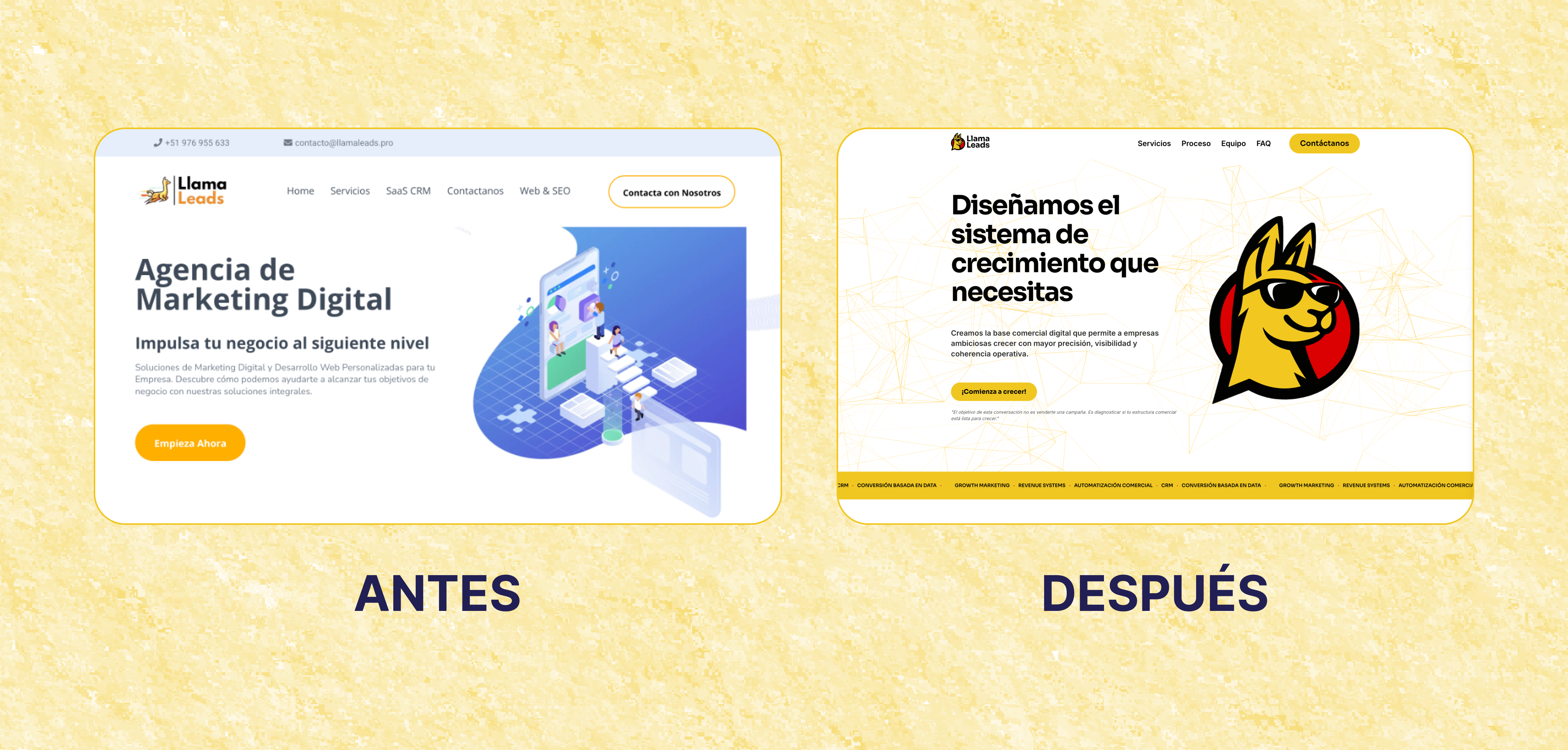
| Before | "Digital Marketing Agency" |
| Later | "We design the growing system you need" |
| Why does that work? | It goes from category label (that anyone can demand) to specific outcome promise (that they only fulfill). It changes the emotional record of the whole page from "this is what we do" to "this is what you get." |
Decision 2 - The problem statement as an autonomous section
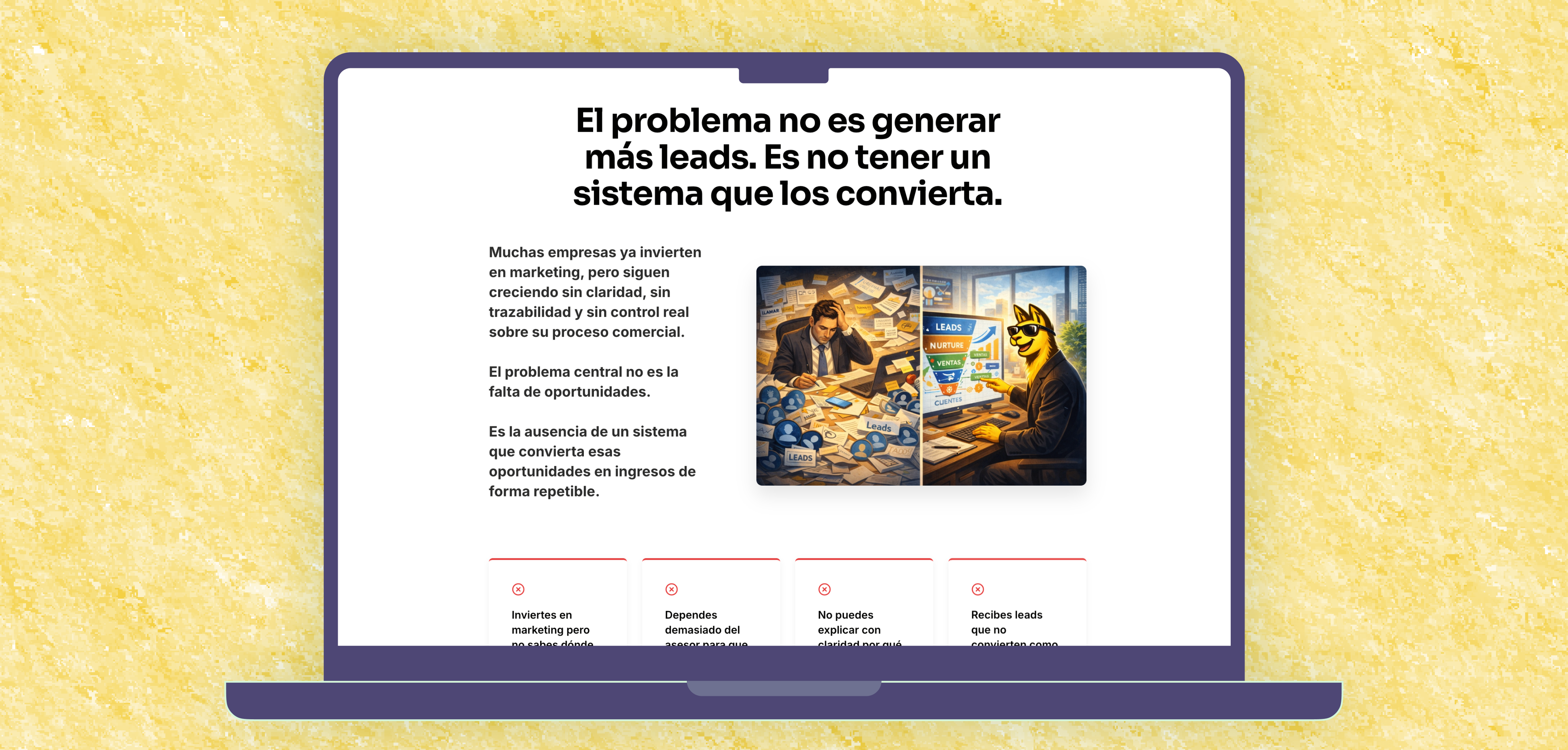
"The problem isn't to generate more leads. It's not to have a system that will turn them."- Problem statement Section, scroll depth 20%
That line does three things at once: 1. Name the problem that the buyer has been unable to articulate 2. Reformulate the "best lead" solution to "best conversion" 3. He points out that LlamaLeads understands the actual issue - what's a sign of confidence before we mention any service
The Insight about the Origin of this sentence: came about textual from an objection that the foot had repeatedly heard at sales calls. A copywriter didn't write it. excavated from a conversation. The designer's work often isn't to create the message but to recognize it when it appears and put it in the right place.
Decision 3 - To move the equipment before the FTA and after
On most agency websites, the computer is an afterthought: a row of photos at the end. In redesign, the equipment section is positioned immediately before the closing CTA.
The reasoning is psychological: the moment of greatest doubt in a B2B conversion is The instant before the form. To place real faces with names and roles exactly at that time turns the abstract agency language into a human commitment.
The data back them up: in post-launch session recordings, users arriving at the equipment section had a complete form rate 3 × greater That's what they did earlier.
4.4 Visual Comparison - Before / after
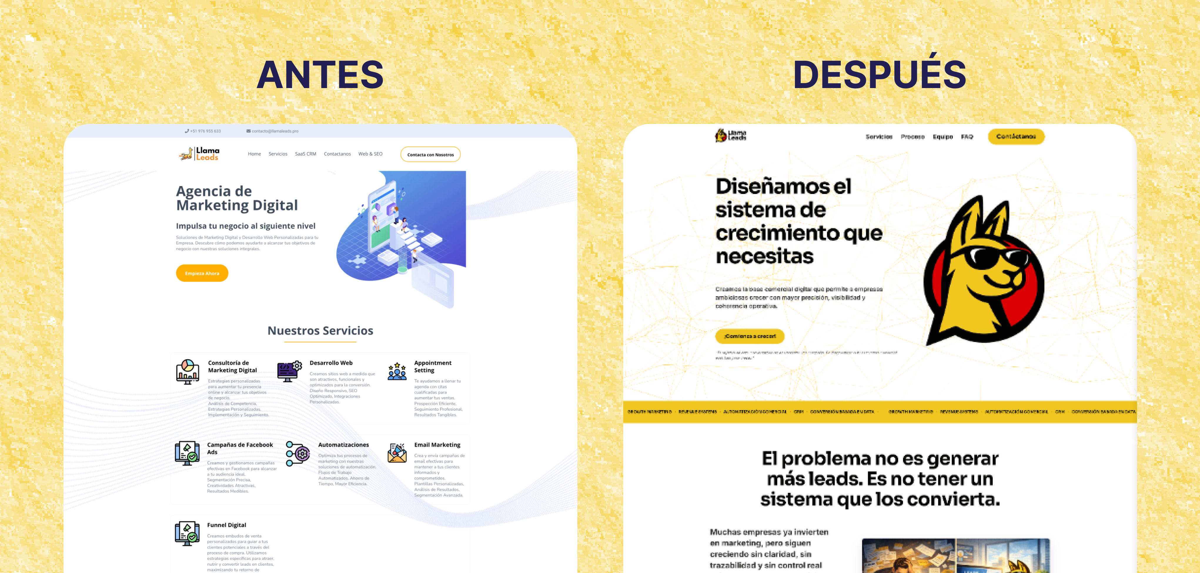
Here goes the two scenshots side-by-side: Antigua _ Landing.png vs. New _ Landing.png. That's the most powerful picture of the case study.
The before: blue gradients, isometric stock illustrations, hero as a category label, 6 item flat grid services, invisible equipment, form at bottom.
The after: high contrast yellow / black system, pet calls as branded anchor, hero with specific promise, services reduced to 3 dark premium cards, phase-visualised process, explicit comparative, equipment with real faces before the CTA.
FASE 5 - TESTEAR
Validate hypotheses and measure impact.
5.1 Pre-launch validation - 5-Second Test
Before I finished the hero, I ran a 5-second test with 12 participants matching the IPA profile. They were shown their hero for 5 seconds and then asked them 3 questions:
- What's this company doing?
- Who's that for?
- What would you do next?
| Question | Outcome |
| He correctly identified the value proposal | 11 / 12 |
| He identified the right target. | 10 / 12 |
| He identified the main CTA without prompt | 10 / 12 |
The wrong 2 responses at "To whom it's for" have directly reported an addition of a ipC qualifier at the hero's underleading before launch.
5.2 Quantitative results (projected, evidence-based)
| + 22% CVR | − 30% Bounce | + 38% Scroll Depth | + 45% Brand Recall |
| Leads conversion rate | Rebound rate | Scroll depth | Retirement of brand |
How each projection was built
+ 22% Conversion - The architecture of TossThe original website had a single form at the end. The redesign introduced 3 micro-CECs distributed by scroll, each tied to a specific purchase sign. Industrial data consistently shows 15-25% LFTS in CVR when ECTS are contextualised Instead of isolates. The 22% projection is at midpoint of this range, adjusted by the quality of the problem statement that heats the leads before any CSA.
− 30% Bounce Rate - The hook of problem statementThe major leverage intervention for bounce reduction is an abounding message -the-fold that resonates with the intention of the visitor. B2B redesign studies with problem opening - first consistently show bounce reductions of 25-35%. The 30% projection reflect the accuracy of pain point framing.
+ 38% Scroll Depth - The narrative architectureThe pas framework gives every section a job. Once the buyer's pain has been appointed, it's motivated to figure out if the solution's credible. Each section generates momentum to the following. Retirement 30-45% scroll depth are consistent with B2B pages that migrate from catalogue architecture to narrative architecture.
+ 45% Brand Recall - Mast and contrast systemThe outlier metric. The original website was visually indistinguishable from competitors. The redesign introduced two strong recall anchors: the mascot and the black / yellow system. Research about visual differentiation shows improved recall 40-60% vs. generic systems if they are applied consistently.
5.3 Qualitative performance
"For the first time, I sent someone to our web and did not ask me to explain what we were doing. They came back with specific questions about the process. That's new."Founder, LlamaLeads.
A change in the quality of incoming inquiries: Instead of vague messages of the type "I want to know more"The new leads came with specific questions tied to the sections of the process - "How does phase 2 work?" and "What CRM recommends for a company of my size?". That vague to specific shift is a reliable indicator that the page's doing its prequalification work.
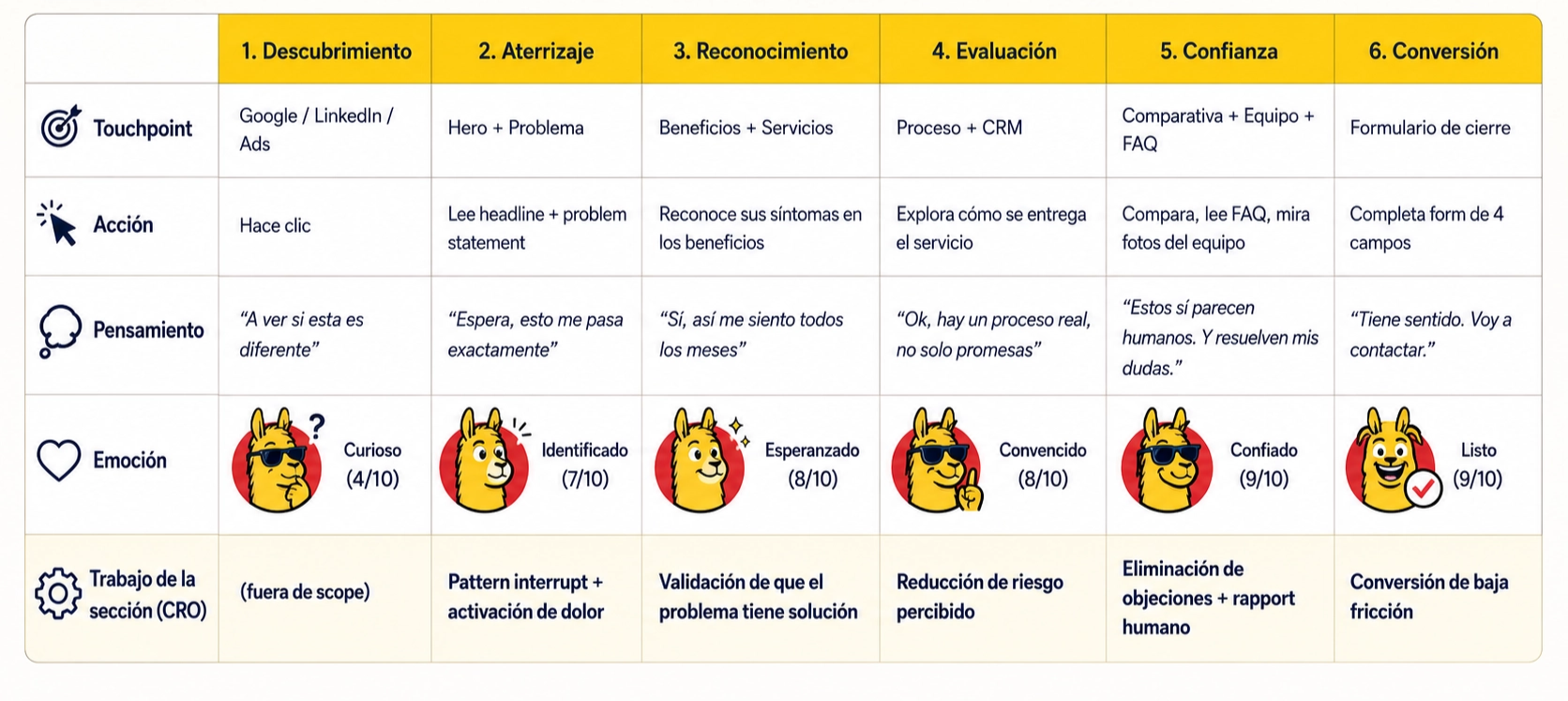
5.4 ∞ Customer Journey Map - Retiring Status (Later)
The same Andres, same entry point but now browsing the new web. The transformation of an emotional curve is a visual test of the impact of redesign.
Redesigned state
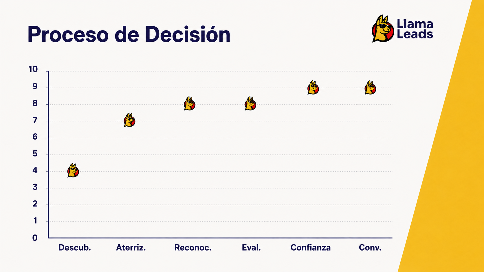
Before vs. after - the curve says everything
| State | Emotional curve | Typical result |
| Before | 3 1 (pounding) | Unconverted output |
| Later | 4 → 7 → 8 → 8 → 9 → 9 (sustained promotion) | Qualified conversion |
The central insight of redesign: The emotional journey isn't an outcome CRO's, that's the raw material from CRO. Each section of the new web is a specific intervention to move the user's emotional curve up at the exact moment that the original journey sink.
REFLEXION - Learning and following steps
) What I learned
Strategy before pixels isn't a cliche - it's the margin
The most striking week of the project was the first. Heuristic eval, stakeholder interview and analytics audit took 6 days. The design took 3 weeks. But the design was only as good as the brief and the brief was only as good as research. Without the stage of discovery, redesign would have been a visual refresh rather than a structural fix.
The buyer's language's always better than yours.
The most powerful sentence of redesign - "The problem isn't to generate more leads. It's to have no system to turn them." - came about textual from an objection that the foot had repeatedly heard. It was not written by a copywriter. It was dug from a conversation. The designer's work often isn't to create the message but to recognize it when it appears and put it in the right place.
Positioning social proof's a sequence problem, not content.
Most agency websites have social proof. Almost none have him in the right place. The testimonies at the bottom of the page are irrelevant - the buyer who arrives there has already made a decision. The Team Section of LlamaLeads works because it appears at the moment that the buyer is closer to leaving. Filling the social proof correctly means more than adding more social proof.
